← All projects
Splash: a design system built to evolve
Splash is the design system behind Omnicom’s (formerly IPG’s) marketing platform, rebuilt in 2020 for an industry that never stops changing. Through three rebrands and an acquisition, it has kept 30+ products in step, from white-labeled agency platforms to one unified brand, Omni+, and in 2024 it moved to design tokens to make the next change faster still. After helping build its foundation, I’ve guided how it grows, from maintenance and documentation to every new expansion.
- Role
- Design system lead
- Company
- IPG, now Omnicom
- Timeline
- 2020 – present
- Scope
- 30+ products, 22+ agencies
- Team
- Emily Chu, Director of Product Design
- Piotr Brzezinski, Product Designer
The problem
In the marketing industry, brands rarely stand still. Holding companies are constantly reshaping
themselves through mergers, acquisitions and reorganizations, and every shift can mean a new name,
a new identity or a new parent company. IPG’s products were built on a legacy design system that
couldn’t keep up: the same platform also had to be white-labeled for every agency, and any change
to color or type meant hunting through products screen by screen. Change was the only constant,
so the design system had to be built to adapt.
My role
As part of the original team behind the 2020 redesign, I helped build Splash’s foundation. From
there, I took ownership of it: maintaining, expanding and documenting the system through every
rebrand that followed. That work spans the component library, usage guidelines, the process teams
use to request and ship new components and, since 2024, the token system.
One system, many brands
Over my years at the company, the brand behind our platform changed again and again:
- 2020KinessoLegacy design system redesigned as the foundation for Splash
- Rebrand 1Kinesso refreshA new Kinesso identity launches
- Rebrand 2InteractPlatform is rebranded as Interact
- TodayOmni+After the Omnicom acquisition, one unified brand
A rebrand isn’t one change, it’s hundreds of screens changing at once. Splash kept them consistent, and its move to tokens turned that into a single update.
Tokens built for change
After years of rebrands, we moved Splash to design tokens in 2024. Emily Chu, our Director of
Product Design, led the tokenization effort, and as the design system lead I worked alongside her
to bring it into Splash.
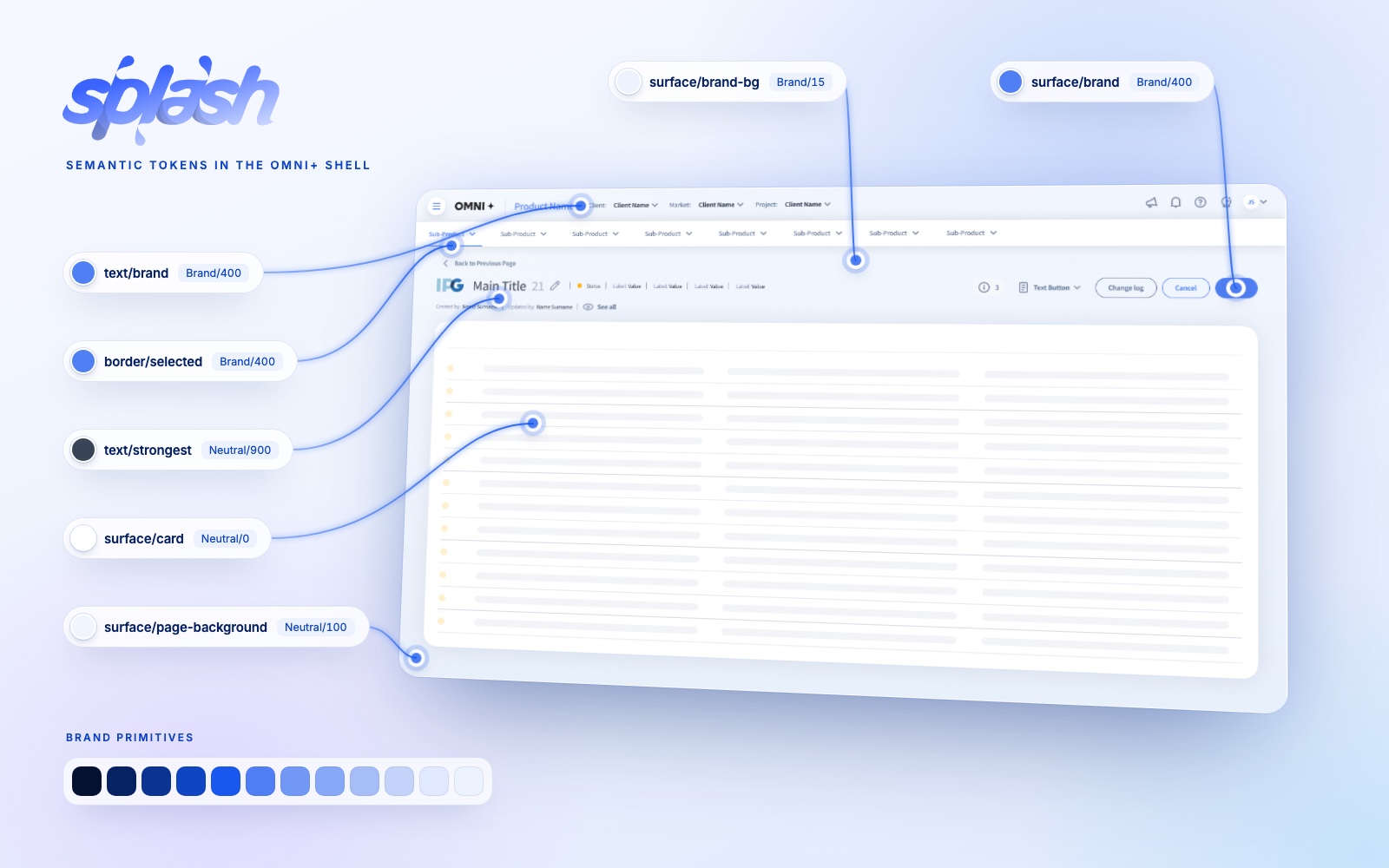
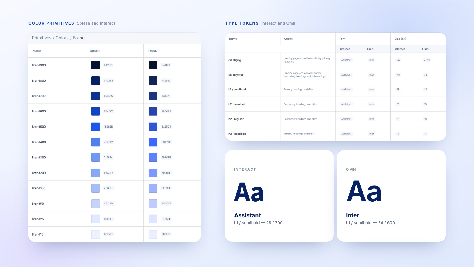
The result is a layered token system. Primitives hold the raw values, like
the twelve steps of the Brand ramp. Semantic tokens describe what a color is for,
like surface/brand or text/strongest, and point to a primitive. Components
only ever use semantic tokens.
That separation is what makes a rebrand efficient: swap the primitive values for a new brand and every
button, table and chart updates with it, with no component changes. The same token names carry
both the Splash and Interact palettes side by side.
Hand-drawn empty states
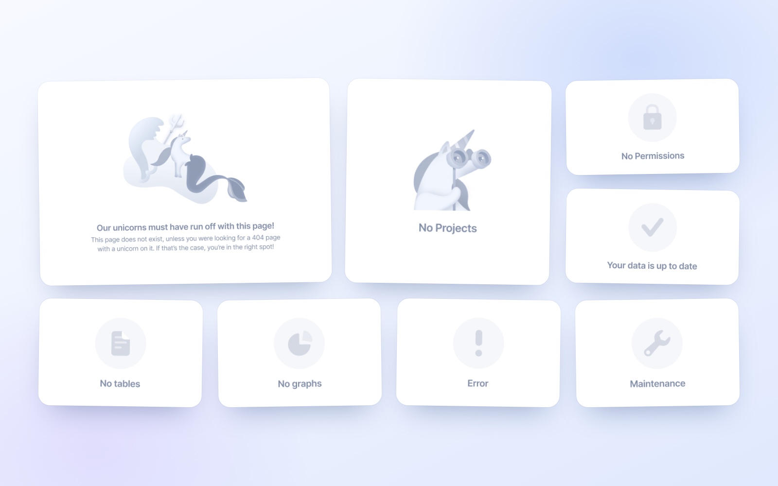
Data-heavy platforms can feel cold, so the empty states are where Splash adds some humanity.
Each one is hand-drawn, from simple icons to a runaway unicorn on the 404 page.
Color that scales to any chart
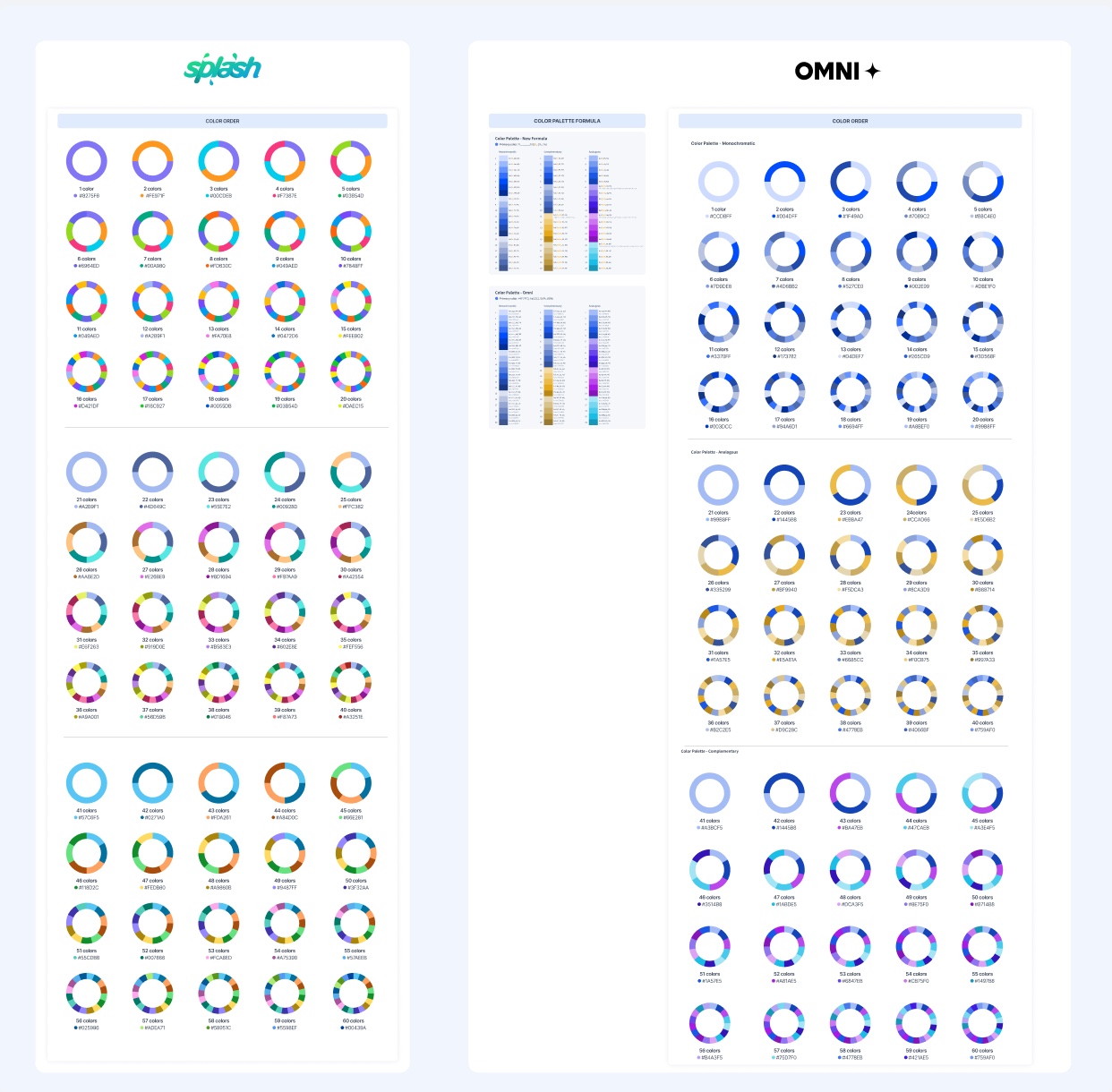
Data-heavy products need far more colors than a brand palette provides, so data visualization got
its own ordered palettes: a Splash set that stays distinguishable from 1 up to 60 series, and
monochrome, analogous and complementary sets for Omni.
Here’s the palette in motion, in a data visualization demo that won Indigo Awards Digital Design of the Year in 2023.
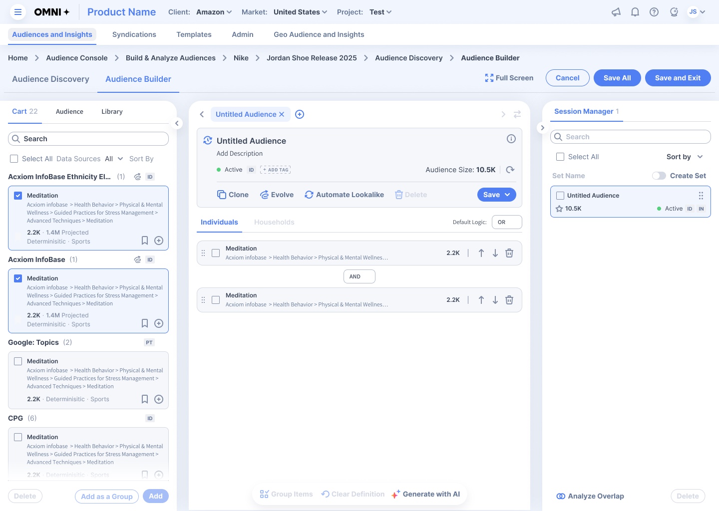
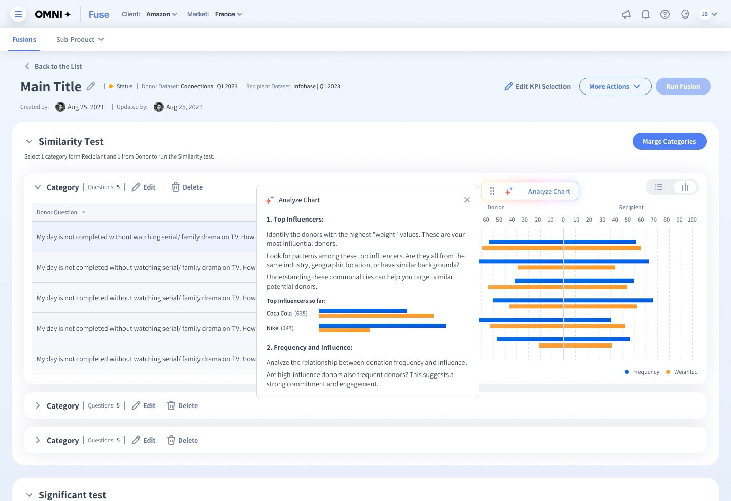
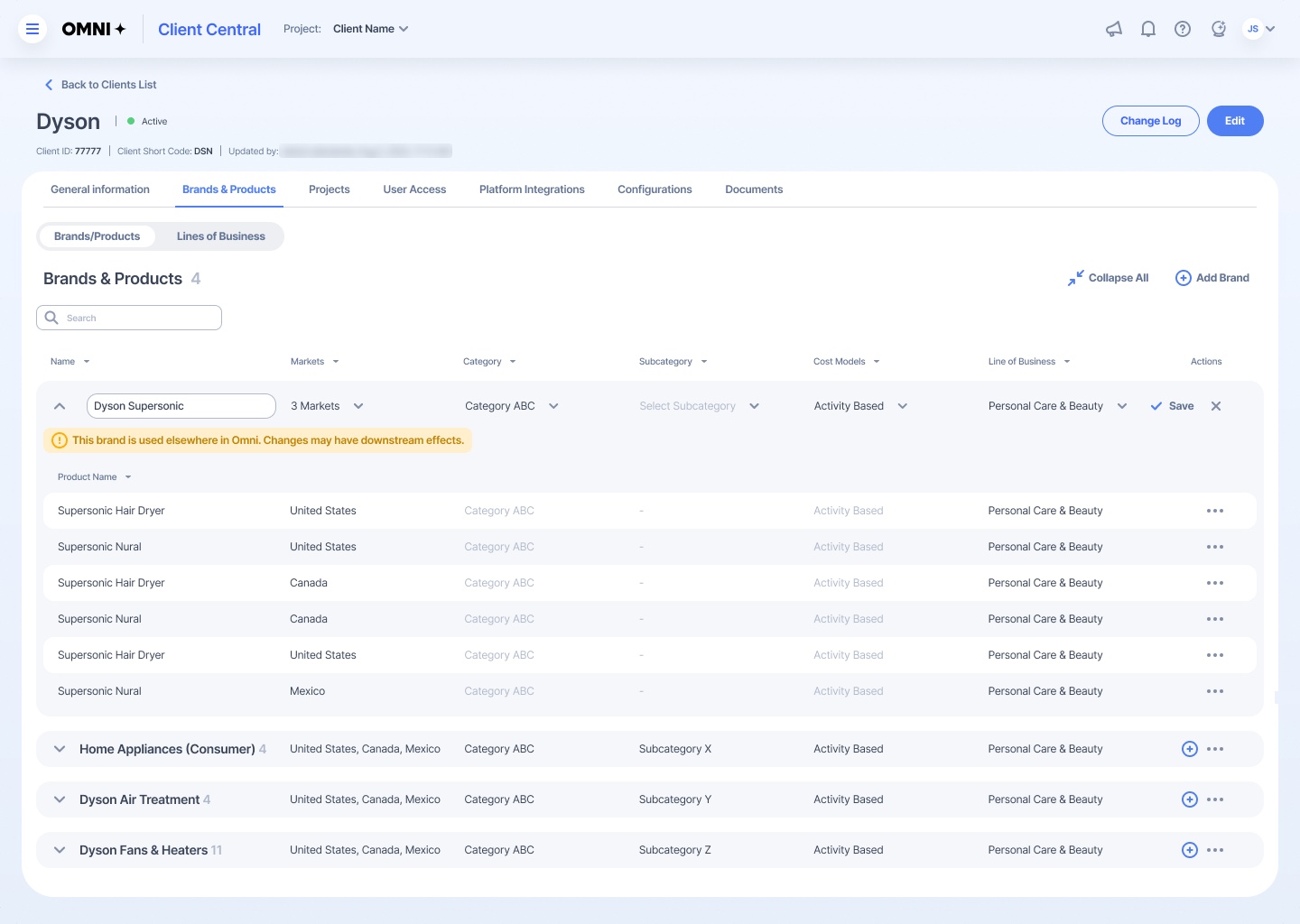
Splash in-product
A look at real product screens built entirely from Splash components and tokens.
Outcome
Splash has carried the platform through every rebrand since 2020 and now underpins 30+ products
across 22+ agencies. We began by white-labeling the product for each agency; today it’s one unified
platform with a single brand, Omni+. With tokens in place since 2024, the next rebrand is a change of
values, not a redesign.
There’s no final version of Splash. It’s a living system, built to keep evolving for as long as
the platform does.